Recently we did some logo work for a guy who had worked with a number of other graphics designers in the past. When he first hired me he said “can you handle my graphic design needs because I’ve asked for quotes from a couple of other designers who are being vague about what they’re going to do, and that bothers me.”
So when I started doing a job for him I sent him an email & asked him the same thing I ask every client, “What are the specs for this job?”…(that doesn’t seem like an unusual question to me but I guess it seemed like a big pain in the butt to him because the client didn’t answer the email.) So I asked him again…..”David, can you give me an idea of how you’re going to use this logo artwork so I can be sure to set it up correctly?” He sent me back an email that said “can’t you just do it the regular way?”.
I tried to explain that while graphics design may not be brain surgery, it’s still a technical skill that works with and outputs technical data. The artwork we create as graphics designers is the technical information that a printer would need to be able to print a job correctly. OR if it’s a digital job, the artwork would be the information that your computer needs to be able to display your website correctly, for example.
To do ANY job, we have to know what it’s for and how it’s going to be used. Is it a printing job that’s going to a “CMYK” or four-color printer?
Is it a spot job such as a two color business card or a silk screened or embroidered t-shirt? Is it a piece of letterhead that you are printing on your inkjet or laser printer? Is it a website that you need to load quickly so your customers don’t lose interest? All of those different types of jobs require us to set up a job with different settings or specs and those settings ensure that the job will print or appear correctly. And no sir, there’s no such thing as “the regular setting” in advertising.
The problem with this client is that neither of the previous graphics designers had bothered to ask him what he needed the artwork for and as a result the client thought I was a big pain in the butt. I gently explained that the ONLY reason his graphics designers hadn’t asked him for job specs in the past is because they either didn’t care about his job at all OR they weren’t experienced or trained enough to know any better. I tend to think it was the former. And the only reason his jobs hadn’t come out incorrectly is either because the printer fixed the specs without telling him or alternatively, he could have experienced a miracle.
What are “Job Specs”?
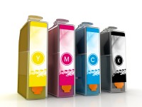
CMYK Inks
Color Printing – when you’re flipping through a magazine looking at the pretty pictures you’re looking at a CMYK or four color offset print job. A CMYK job prints with the standard, four ink colors that offset printers use: cyan, magenta, yellow & black (thus abbreviated to CMYK). The artwork for this job tells the printing press how many of each of those four inks to use when they are mixed to make any one color. If the photos are not set up as CMYK, but as “RGB” (or Red, Green, Blue) for example, the job isn’t going to be able to print at all without being fixed. So if my client gave us job to his last printer this way they would have had to fix the artwork.
Spot Printing – This type of printing was very popular in the old days because it saved money by using less press time, less set up & clean up time and less than the standard 4 inks. Instead of mixing the four CMYK inks as with Offset Printing, Spot printing allows us to pick a premixed ink color that the printer essentially grabs off a shelf and uses “as is” to ensure that the desired color is reached. However with the rise of “discount printing” (which is really just “gang” printing i.e., printing multiple jobs on the press at one time) there are not as many reasons to print spot color. Spot color printing is still used however. Sometimes when a client is particularly concerned about their logo colors, for example, we might print a job with 2 or 3 spot colors OR we might print a CMYK job and ADD one or two spot inks (for what’s called a 5 or 6 color job). Needless to say if we don’t put that information into the artwork, then the printer won’t know what color to use and the printing presses will be confused as hell. There are a number of different types of spot colors used, but the most famous one is made by “Pantone” and you can get a “Pantone swatch book” that let’s you pick the spot colors for your job.
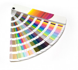
Pantone Swatch Book
By the way, you cannot pick your colors by looking at a job on the computer monitor…..what looks orange to me could look pink to you. The correct and ONLY way to do this is to look at a physical Pantone book and pick the colors that way. Anything less than that and you’d be guessing.
Digital Printing – there are digital presses now and you would prepare your artwork to print on a digital press the same way you would if you were sending a job to be printed at an offset printer. however there is some variation in this so for that reason…..you need to ask your printer for his printing specs and give those to your artist.
Digital Jobs – not all jobs are going to print, and thus not all artwork has to be prepared for that purpose. A website design is not for printing (unless of course you want people to be able to print the website on an inkjet printer, and that has to be considered before the job is half done). There are not printing specs for a job like this but there is still information that has to be integrated into the file that is critical to ensuring that your job looks good and loads correctly. For example, images that go into a website don’t have to be as high resolution as the images in printing jobs. Here’s the rule: You’ll need 72 dpi images for digital/web work, 150 dpi images if you’re printing a job on your inkjet or laser printer and 300-600 dpi images if you’re printing Offset/CMYK.
A note about resolution – if you give your artist a photo that’s the size of a postage stamp then they cannot increase the physical size of that job to be an 8″ x 10″ job, for example. So always give your artist the biggest, highest resolution images you have and then depending on that, your artist should be able to tell you how big he or she can make that image. don’t skimp on images…there’s not much worse than trying to use crappy images on a nicely laid out job (well, it also sucks to have typo ridden text, but that’s another article).
While there is a whole lot more that can be said here, I think this is a good introduction for you whether you’re a client with a print job or a young graphic designer who slept during this class in college. If you have any questions about this please just shoot me an email….at emily@thebrandxagency.com